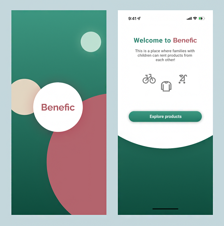
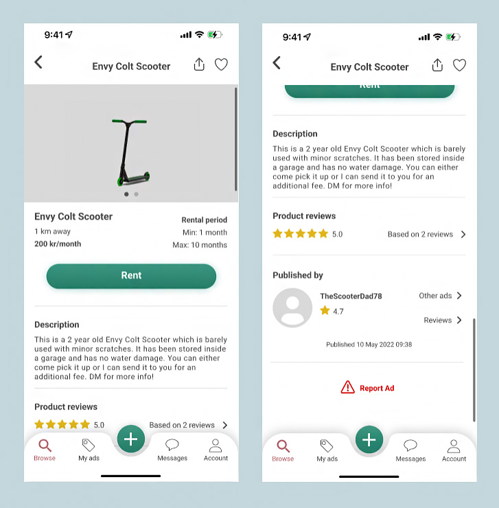
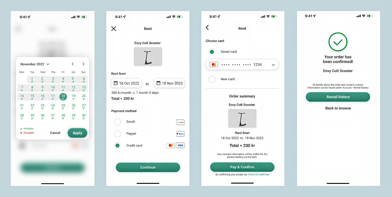
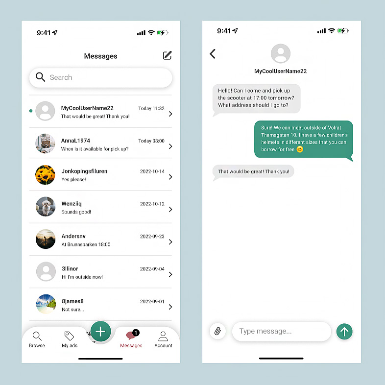
Site logo.

Benefic

UI-design of a mobile app where families with children can rent products from each other. Families with children need to buy a lot of stuff but many things are only used for a short period of time. A more sustainable solution could be to simply rent what you need, and also let others rent the stuff you own but not currently use.


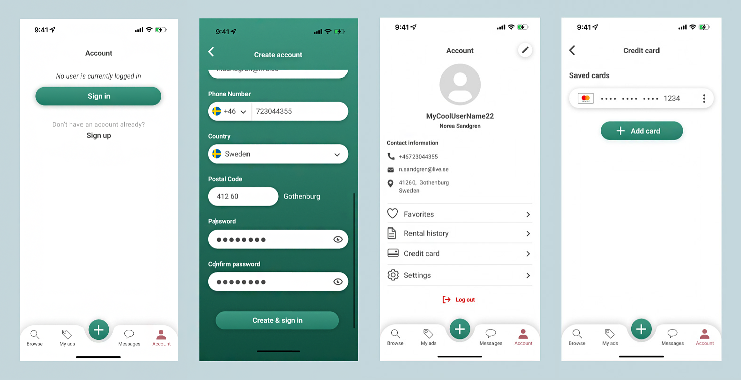
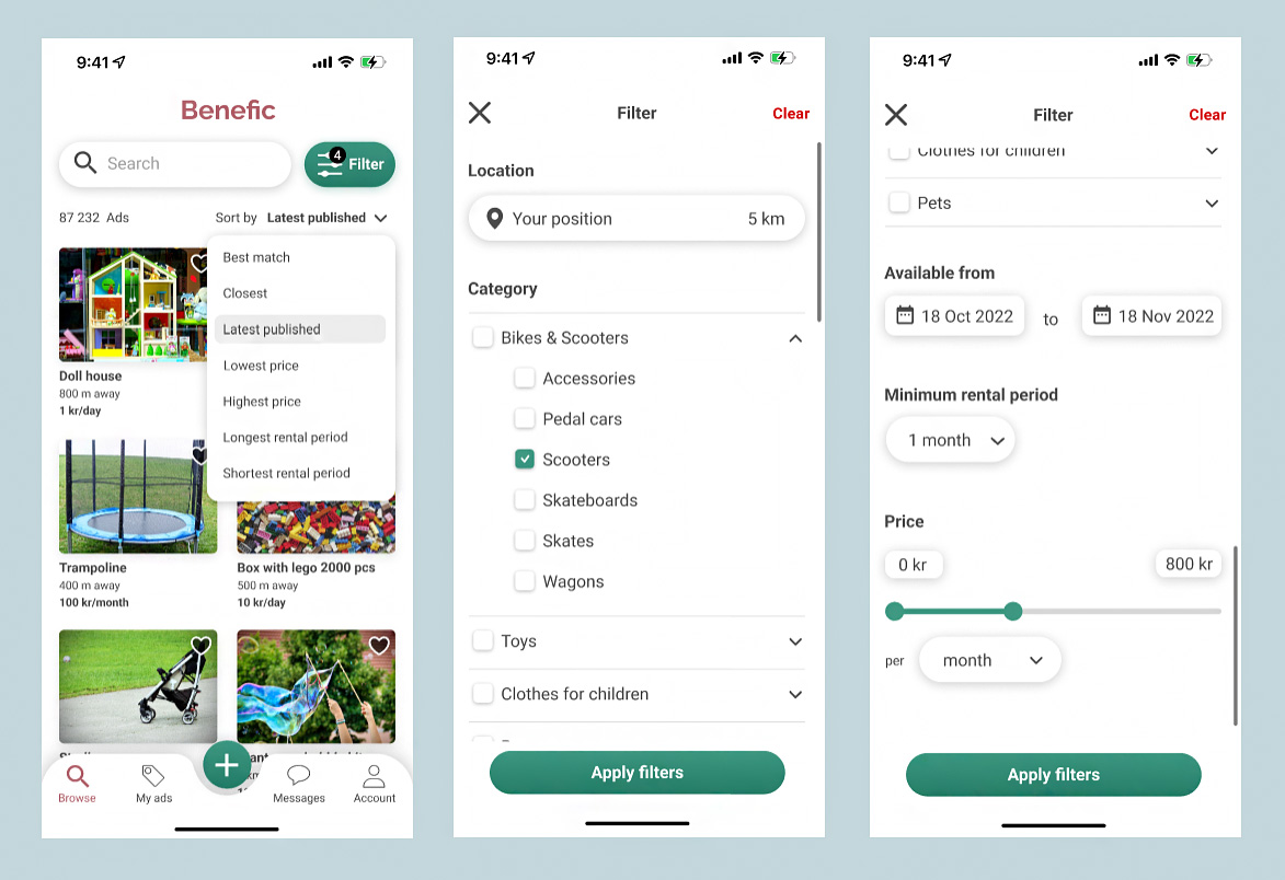
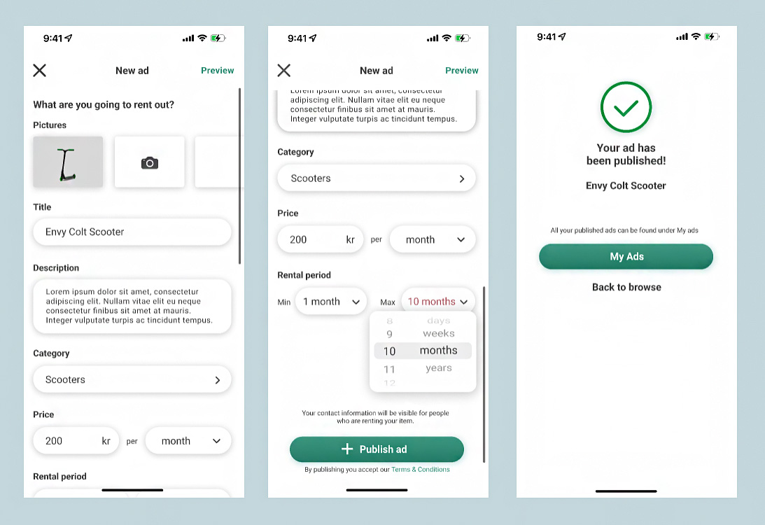
This was a three days long home exam in the course “Mobile computing: Design and implementation”. The purpose was to create the UI for an already described app. We designed the most necessary screens only. Motivating design choices and elements based on Material Design and iOS Human Interface Guidelines was also part of the exam.

Type of project
Home exam

When

17 Oct 2022 – 19 Oct 2022

Tool

Figma

Splash screen & Introduction

When the user first opens the app he will see a branded launch screen for a few seconds. According to Material Design 2 (MD2), launch screen section, a “branded launch screens express branding while an app loads, by displaying a logo or other elements that improve brand recognition. Avoid using text on this screen except your logo and, if applicable, a tagline.” 


A branded launch screen should be clean. This one only shows the brand logo and a few elements in the form of colored circles. This introduces the user to the app’s UI style, such as round shapes, soft shadows and color palette.

Benefic splash and start screen.

Account page

On the account page users can log in or create an account. When logges in they see their personal information and edit it by tapping the small FAB. There are text buttons with icons that enables more actions, and they are placed in a list separated by dividers. Icon and text are combined to communicate the meaning of the button as clearly as possible. The arrow pointing to the right indicates that the user will be redirected to a new screen. For example Tradera and Zalando have a similar design on their account page. 


The log out button is a text button since users will likely stay logged in. Its color is red to indicate that the action is negatively loaded. When pressing the Credit card button the user can save cards so they do not have to write card information every time they rent an item. A user can save multiple cards. Every card is displayed as a list tile to not take up too much space.

Benefic create account and logged in account.

Search and filter

When signed in the user will be redirected to the browse page. This is the home screen when the user is logged in. The app has a center-aligned top app bar that shows a title related to the page that the user is currently at. Since this is the home page, the app logo is displayed, consistently following how most apps look like. The app bar is filled with white color to look as clean as possible. If users scroll down to see more content the content will disappear under the app bar.


The app uses bottom navigation with four destinations and an inset FAB for creating new ads. MD2 (bottom navigation section) has done research to “understand the usability and design preferences for embedding a floating action button (FAB) in the bottom navigation bar”. They found that “participants liked the bottom navigation bar with an embedded, centered FAB because of the aesthetic and ergonomic benefits”. However, they also found that design preferences for the shape of the bar varied by different parts of the world. Having the FAB inset is just as good as overlapping, but inset suits the rest of style for this app.


Both icons and text labels are shown since MD2 (bottom navigation section) says “It’s best to pair icons with text labels”. To clearly show the active destination, the icon and text are filled with the accent color. The icon also becomes filled when active, except the magnifying glass gets thicker stroke.

Screens showing how to search and filter among products.

Create new ad

When tapping the floating action button (the green plus) users will be redirected to a screen where they can create a new ad for a product that they are going to rent out.


The UI for adding pictures to the ad is similar to Tradera and Blocket. To begin with all the pictures are a filled, white container. When users add pictures they will be placed in the containers starting from left to right. The container that will be filled next has a camera icon to it.


The text field for description uses overflow text so the field expands when the written text is long. MD3 (text field section) says that overflow text is “useful for compact layouts that need to be able to accommodate large amounts of text”. Even though the text field might be long I think this it is more important to be able to see the description as a whole instead of showing only a few rows at once where the user has to scroll a lot.


Selecting a minimum and maximum rental period is done with a wheel picker within a modal view, according to iOS Human Interface Guidelines (HIG) (pickers section). Previously I have been told not to mix Material Design Guidelines with iOS Human Interface Guidelines. But I think this wheel picker is a compact, intuitive way to choose a combination of different types of values. This wheel picker suits the app style really well.

Screens showing how to create a new ad in Benefic.

Product page

When tapping on an card the user jumps to a screen containing all details about the item. Share and favorite buttons in the top app bar provide actions that are related to the current screen. Icon buttons are suitable when compact buttons are required and are often displayed in a top app bar. The content is displayed in a list and separated by dividers.


There are low emphasis text buttons such as “Based on 2 reviews”, “Other ads” and “Reviews” with an arrow ponting in the right direction. The arrow indicates that tapping the button will redirect the user to another screen. They are considered low emphasis since they are optional for the user. The Report ad button is in red color to indicate that it is a negative action. It is a text button since it will be used rarely.

Screens showing the product page in Benefic

Rent

When tapping on the rent button on an item page users will be redirected to a rent/checkout screen where they have to fill in a form. The different payment methods uses radio buttons since only one option can be made. The selected item is visually prominent with a primary fill inside the radio button. Since there are rather few options there is no need to hide them under a menu. All of them are visible directly.


The user can pick what days he wants to rent the item. This is done with a calendar picker. It has been designed with MD2’s mobile calendar date picker in mind but with a few changes. The days have red and green color together with icons to show when the item is available/occupied. SInce using red/green text only would not be ideal in case of colourblindness, legends have been added to clearly show the meaning of the icons and colors. When calender picker is active the background is blurred to make it less visible. 


After chosing credit card as payment method the user is sent to another screen. It is at the same level of hierarchy as the previous one, the next step in the checkout flow. On this page the user can choose to pay with a saved card or a new card. When new card is chosen additional text fields will pop up that allows the user to write new card information. When saved card is chosen the user can pick one of the saved cards from the drop down menu.

Benfic screens showing the flow of renting a product.

Direct messages

Another feature is that users can send messages to each other. It can be neccessary to communicate when and how the product will be picked up.

The messages tab shows a badge when the user has unread messages, similar to the filter button. The UI of the message app follows what standard message look like. Dividers are used to visually distinguish every conversation.


The floating text showing when the message was sent makes it harder for the eye to distinguish the conversations without a divider. The colors are chosen according to the color scheme for the app to make it match the rest of the app.


When showing a conversation, the bottom navigation bar disappears to leave room for the text field where you write a message. Nearly every app hides the bottom navigation bar when showing the messages so this app follows common practice.

Screens showing messages in Benefic.

Reflection and learnings

There are some differences between the UI I show here in the portfolio and the UI that I handed in during the exam. I continued to iterate on some details. After handing in my exam I got the feedback that it is not a good idea to force the user to register an account before being able to explore the app. From an app owner’s perspective it might be beneficial to let users register first. But from the users’ perspective, this creates a high barrier to entry which leads to users uninstalling the app before even knowing what products are available. This feedback has made me more aware about how every screen impact the flow, interaction and experience.


Now that I look back on the UI I can really see that the design is uneven, meaning that some screens are more polished than others, which is quite natural due to time limit. For the ‘rent and pay’-screens I could have looked into more existing solutions since these kind of features are very common in apps today. For some components I also think that the shadows are too strong. 


What I truly appreciate about this UI is my bold approach in experimenting with various gradients and colors, as well as incorporating unconventional elements like the bottom navigation bar that follows the shape of the floating action button. I selected a shape language and color palette that genuinely reflects my identity as a designer. Therefore this project serves as an excellent portfolio piece, despite the design not being entirely perfect.