Site logo.
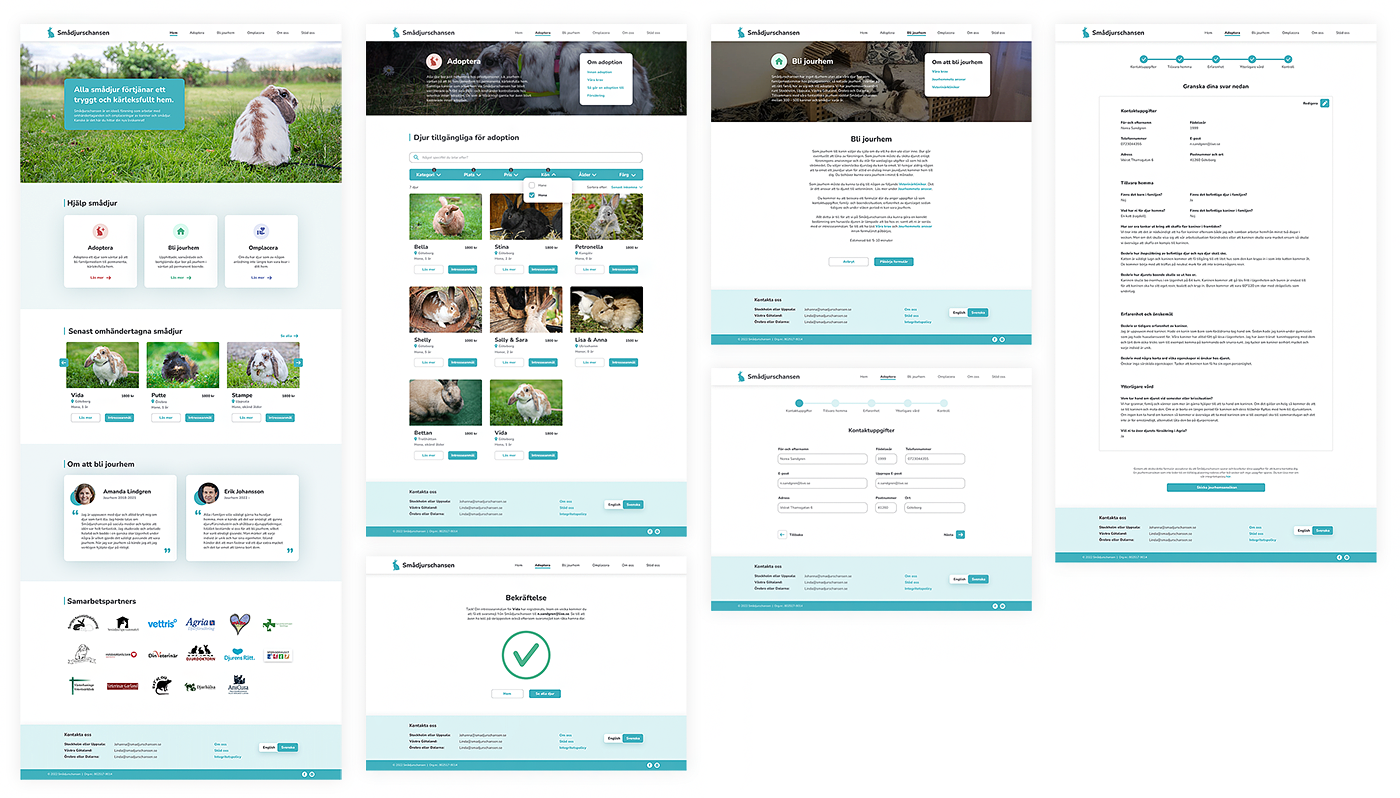
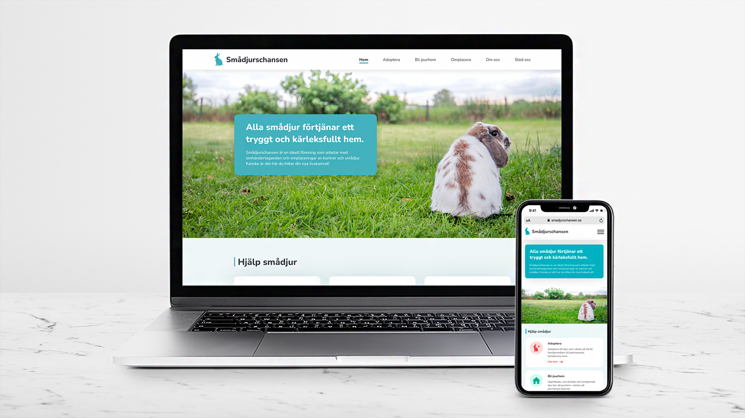
Mockup of the website redesign of Smådjurschansen.

Smådjurschansen Website Redesign

A personal project where I redesigned the wesbite of Smådjurschansen, involving both UX and UI design. During my Master’s most tasks have focused on UI, but not so much on research and the whole design process. With this project I wanted to make use of my holistic design perspective that I learned from my Bachelor’s and include it in a digital design.

Smådjurschansen is a non-profit organisation that takes care of maltreated pets and relocates them to permanent homes. In this project my goal was to create a modern and inspiring redesign that feels reliable, inspiring, and easy to use.

Type of project
Personal side project

When

Dec 2023

Methods

Benchmarking, brainstorming, persona, HTA, PHEA, prototyping, usability testing

Tool

Figma

The current website

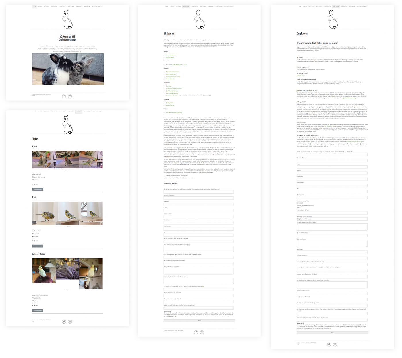
Smådjurschansen's current website, selected screens.

The reason I started redesigning Smådjurschansen is because I am a pet lover and really support what they are doing. I’ve been close to using their services many times but I have always been distracted by the bad UI of their website that just makes everything difficult and time consuming. This was a personal project were I could try to apply some UX and UI knowledge in a fun and inspiring way.


I started analysing the current website and identified some areas of improvement:

  • It is very blog-like, and lacks inspiring visuals. The practical information is there, but not more than that.
  • Its simplicity can make it difficult to find what you are looking for due to limited functionality for searching an filtering.
  • There are a lot of tabs and menus at the top bar that leads to excessive navigation.
  • Some pages present a wall of text.
  • Filling out forms lead to cognitive overload. Many questions are repeating and irrelevant depending on how users answered the previous questions. 

HTA

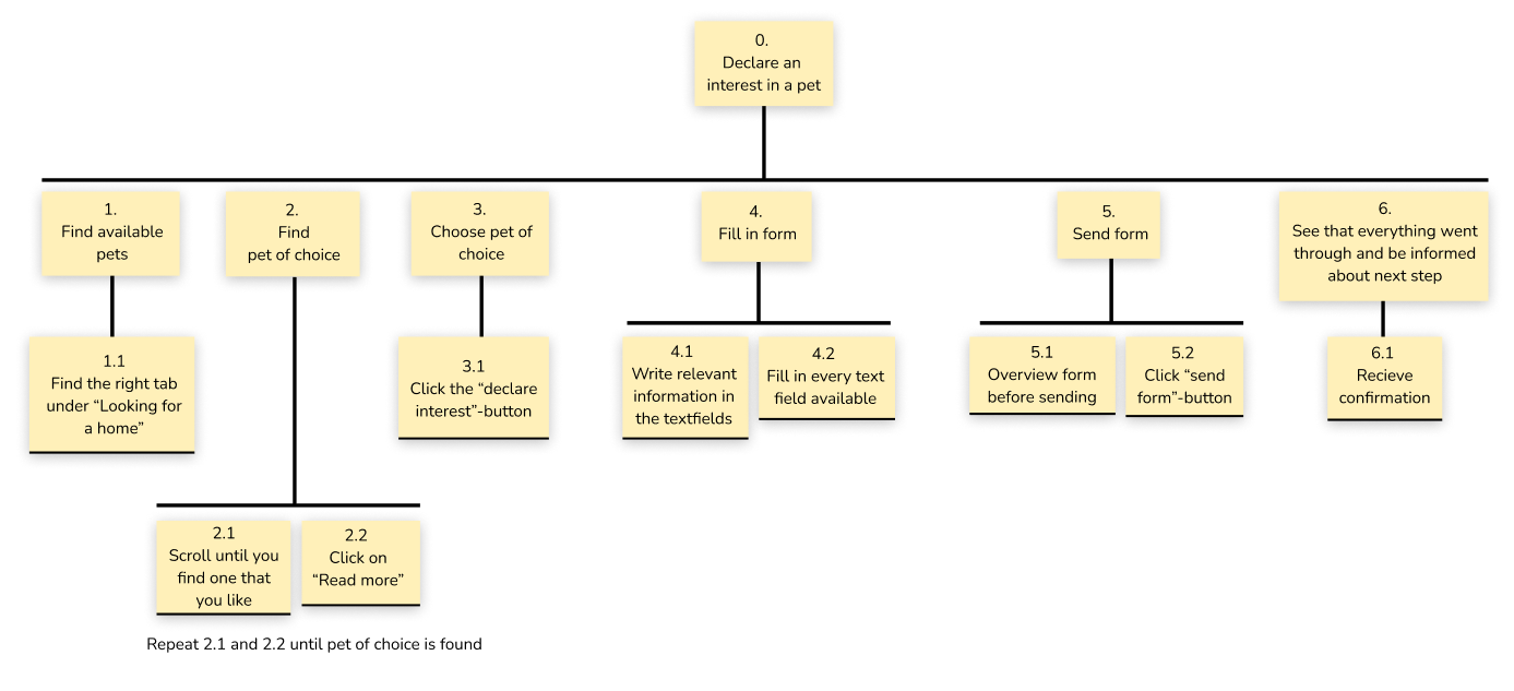
A Hierarchical Task Analysis (HTA) was done for the current website to identify the goals and actions involved in the process of declaring an interest in a pet. It worked as a base for doing the PHEA below.

HTA of Smådjurschansen's website.

PHEA

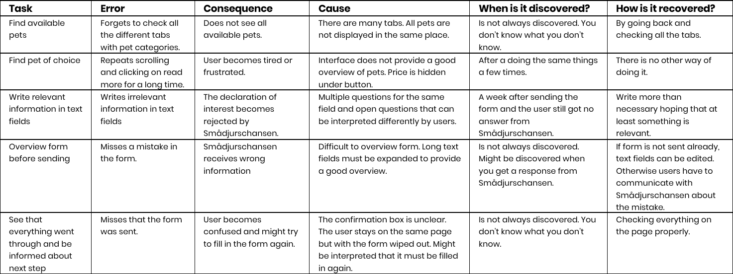
A Predictive Human Error Analysis was done on the current website to predict where and how users can make errors.


PHEA of Smådjurschansen's website.

Persona

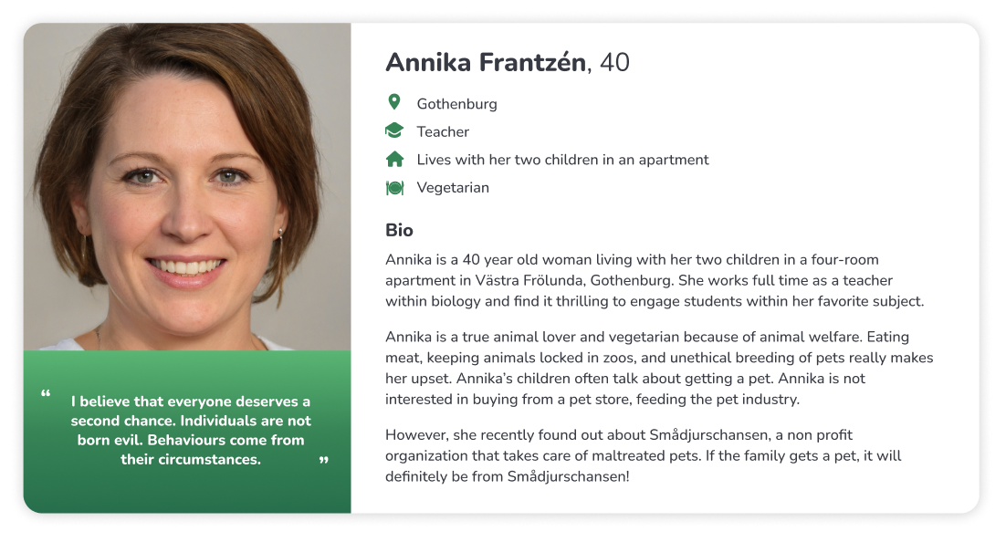
A Persona was created to represent archetypical users, making it easier to emphasize with them. It is based on people that I know have adopted from Smådjurschansen or are interested in doing it.

Persona for Smådjurschansen.

The redesign

Smådjurschansen website redesign, selected screens.

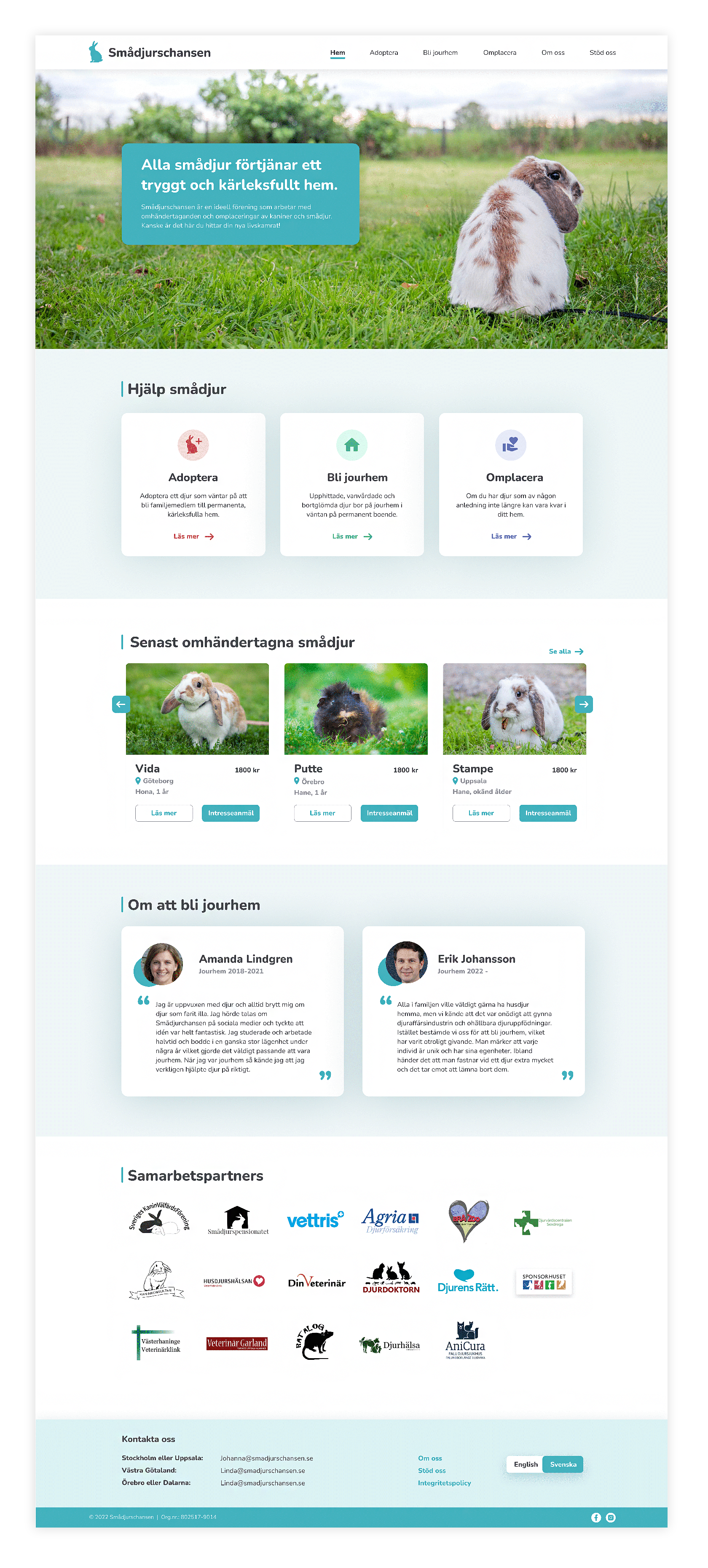
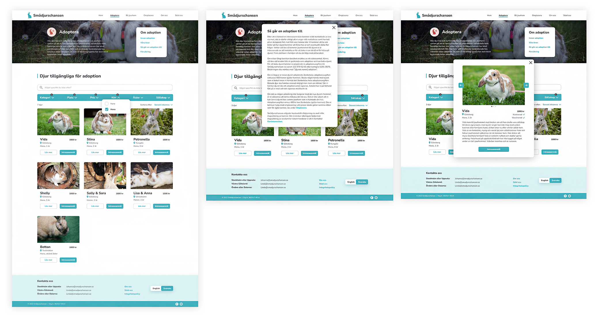
The redesign is supposed to be inspiring and give a better overview. Similar information have been grouped together and are presented at the same place to reduce navigation between pages. There are more options for searching and filtering among animals. Text heavy information is expandable in text links instead. It was important that the information was still easily accessible but without overloading the user. 


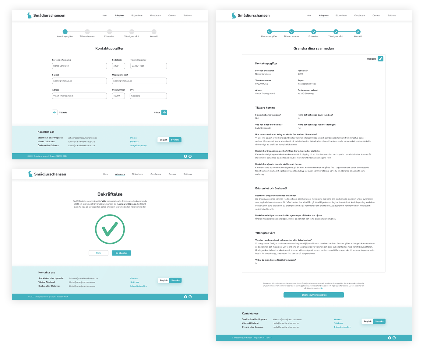
However, when it comes to filling in forms, they can be very time consuming, so here I decided that it was necessary to divide the information into multiple pages. I searched information about best UX practices for designing long forms. The different pages represent different steps, and a progress bar is shown to easier guide the user through the process and reduce information overload. Before the user starts filling in the form he will be informed about the estimated completion time.

Smådjurschansen website redesign home page.
Smådjurschansen website redesign showing screens for browsing and finding the perfect pet.
Smådjurschansen website redesign showing screens for filling out a form when adopting a pet.
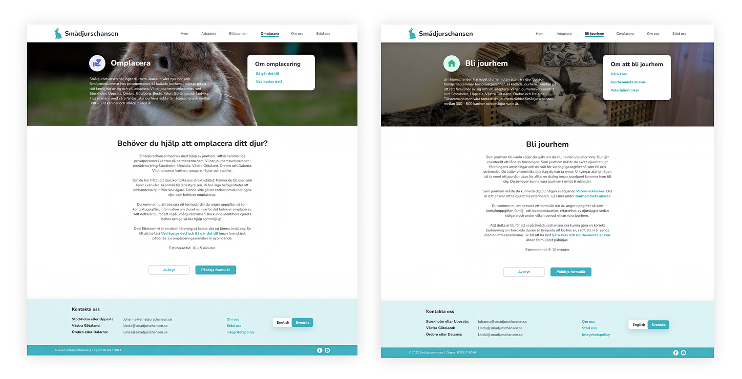
Smådjurschansen website redesign showing two screens. The first screen shows the tab for surrendering your pet. The second screen shows the tab for becoming a pet shelter.

The graphic profile

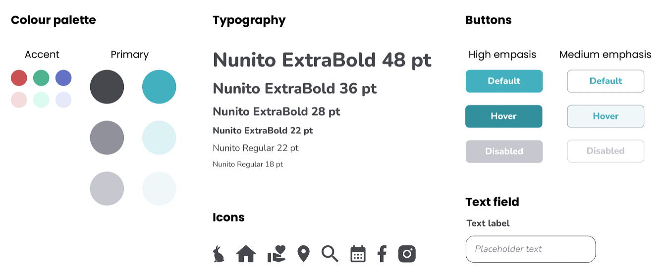
Design system and graphic profile for Smådjurschansen's redesigned website.