As part of the course Graphical Interfaces, we designed a video conferencing app with a backlog feature. The purpose was to create the UI for a video conferencing app with an additonal main feature. We chose backlog as our main feature since task collaborative apps such as Trello does not have extensive communicating functions. We were also supposed to present a solution for hybrid meetings, i.e. where some people attend online and some people attend in person. The most challenging part was to include all the functionality while still maintaining a transient posture.
TaskCollab
Type of project
Course project
When
17 Oct 2022 – 19 Oct 2022
Teammates
Geoffrey Chen, Ebba Lindberg, Maja Ulén, Panpan Zhang,
My contribution
Video conferencing and breakout rooms
Tool
Figma
Background
The pandemic brought online collaborative tools into centre of global attention. A great majority of collaboration these days happen online by using collaborative tools. Even after the pandemic many people anticipates more remote work to decrease traveling and thus climate impact. Therefore, the group project theme for 2021 was about designing a mobile GUI for remote collaboration.
Requirements
- Video and audio calls
- Breakout rooms option
- Messages – personal and group
- Hybrid situation meetings (some people join together in the same room and some people join remotely)
- Additional collaborative feature
Wireframes
We began creating different wireframes and lo-fi prototypes to set the overall structure and layout of the app. It was challenging since it included so much functionality. We discussed what should be the main purpose of the app. Was it mainly a task app with additional communication features or a conferecing app with additional task features? We realized that the way we designed the start screen would set the direction of the app.
Main structure
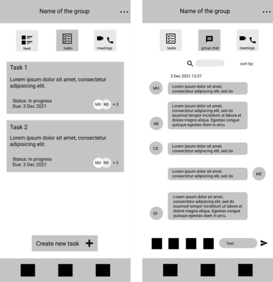
Defining the main structure of the app was important since it would heavily affect the end result. We asked ourselves what tabs should be included and where should they be accessible. We did not want users to tap too many times to reach main functions.
We experimented with different tabs such as feed, tasks, meetings and group chat but realized that the app became messy quickly. In the end we decided to remove the feed view and have project overview as our main view. The videoconferencing and message functions were chosen as side-functions.
Hybrid meetings
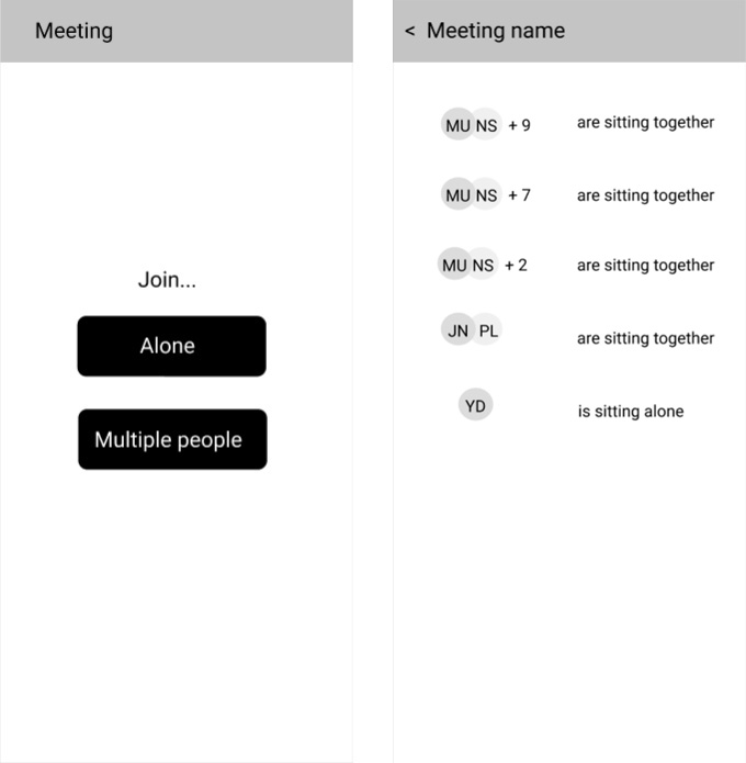
Audio loops during hybrid meetings are a common issue. The first solutions we could think of were hardware related. But then we came up with the idea of having different options when you are about to enter the meeting. By telling if you sit by yourself or together with others in the same room (who also join the same meeting) audio loops can be avoided.
The main idea was that the app should adjust microphone, speaker and audio settings depending on if people sit together physically. We began sketching the idea how such an interface could look like. In my opinion this was the most interesting part since nothing similar had been done before.
Video Conferencing
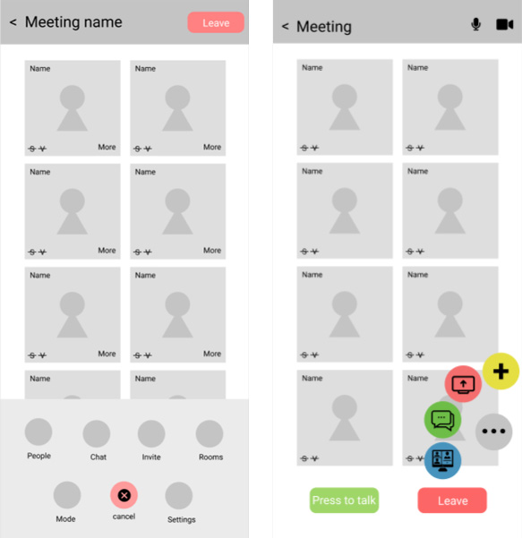
The video conferencing screens are mostly about layout. Meeting participants’ names and cameras should be visible as well as mic, speaker and video settings. Additional functions such as screen sharing and breakout rooms should also be included, as well as the possibility to leave the meeting.
We experimented a lot with how more features from tapping the three dots could be displayed. An overlay would let users to see what is going on in the background but it also had the tendency to look cluttered.
The final design
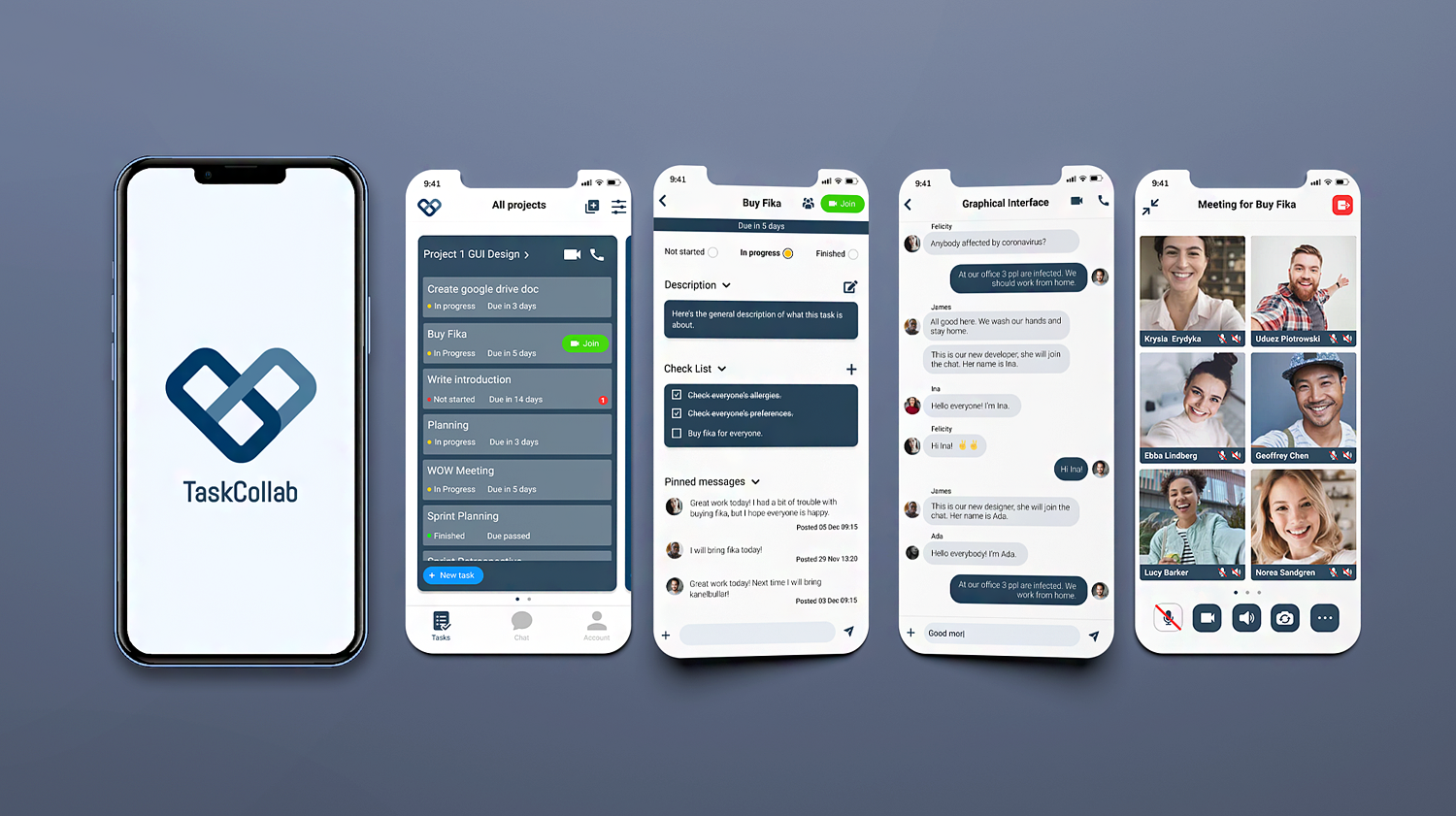
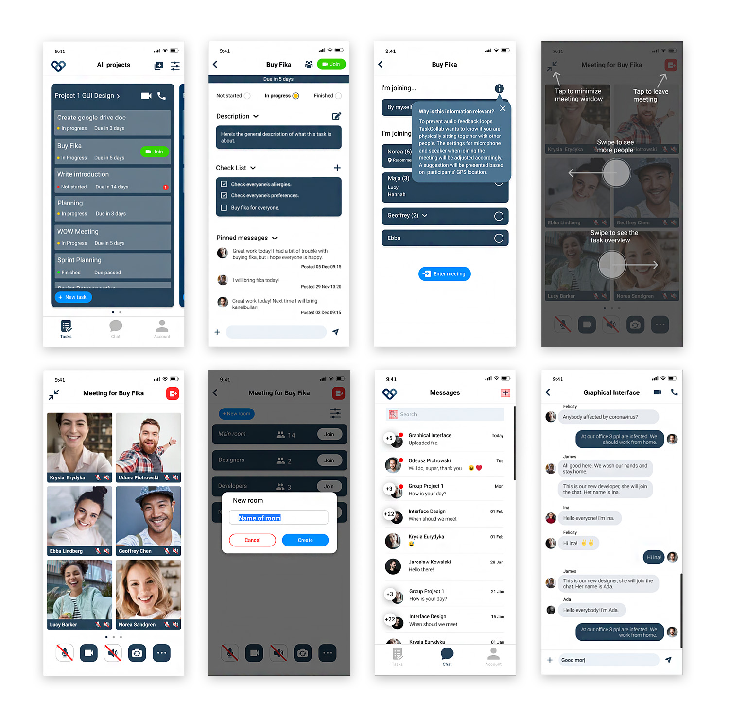
The final design resulted in a blue theme where everything is based on different projects that users share with others. Within the project there are different tasks. Video meetings can be accessed on project level, task level and individual level. The tasks show due, status, description, check list and pinned messages.
When joining a meeting the user tells if he is joining by himself or sitting together with others. Since this function is new we decided to add an information icon explaining the meaning of the different options.
An instructional overlay guide is shown when the user enters a meeting for the first time. The view and functionality for video conferencing is similar to Zoom, but with a few changes. For example when managing breakout rooms, the main meeting is also considered a room. This makes it easier to join and leave the main meeting.
The message view is similar to how most apps look like. A list of conversations are presented, both group conversations and private conversations. Clicking on a conversation shows all the messages in the conversation.
Reflection and insights
At this time I had only used Adobe XD so this was the first time I used Figma. I realized that it is an awesome tool for collaboration. The design is not perfect and lacks consistency at some places. It is quite clear that the different frames were made by different persons.
We should have spent more time on wireframing and maybe create flow charts to get a better grasp on navigation and hierarchy. If we had more time we would do usability testing and work more on making the app user friendly. However, we still got positive feedback from the presentation that we used proper sizing on everything. We also happened to be the only group who came up with a concrete solution to the hybrid meeting problem.
